
Project Overview
Project: Argon AI — Transforming an AI-Powered Research Assistant into a Usable Product
Role: Lead (and Sole) UX Designer
Duration: ~3 months
Team: 2 Co-founders (Client), 1 Project Manager, 1 Developer
Tools Used: Figma, Notion, Zoom, Miro, Slack
Deliverables: UX Audit, User Flows, Wireframes, UI Design, Design Systems, Developer Handoff
The Problem
When I joined the Argon AI project, the platform was in a very early MVP state. The two co-founders had built it using basic front-end development, and while the core ideas was promising — an AI-powered research assistant — the user experience was confusing and difficult to navigate (not to mention no thought had been put into UI). As a result this was more like a troublesome intern than a helpful assistant.
As the sole designer on the project, I was brought in to rethink the interface from the ground up, improve usability, and ultimately make the product feel trustworthy, modern, and usable by real researchers doing real work.
Problem Statement
Healthcare and academic researchers need a clear, intuitive way to interact with dense, high-stakes research data and AI tools, because their work depends on speed, accuracy, and credibility.
HMW Questions
Argon’s subject matter is vast and complex, so I focused my design approach around a few key questions:
How might we simplify the experience of interacting with complex medical and academic research data?
How might we guide users through unfamiliar workflows without overwhelming them?
How might we make AI-generated insights feel trustworthy and usable
Designing in a world I didn’t understand (yet)
Although I was brought in to lead the design, I quickly realized I had to get comfortable with being uncomfortable. The subject matter — medical research, preclinical data, sell-side analyst reports — was unfamiliar to me, and in early meetings, I often had to stop and ask the co-founders to explain terminology or workflows at the simplest level. At first, I felt out of my depth, but I quickly learned this would be my greatest strength. The CEOs of Argon are extremely smart academic researchers and they built a platform for themselves, that they and they alone knew how to navigate. As the UX Designer, it was my job to translate the platform into something a much larger community could engage with. My role was not only designer, but translator between the client and their users.

Project Goals
The main goal of this project was to transform Argon AI from a niche, founder-built MVP into a scalable, user-friendly platform that could support a wide range of researchers. From a UX perspective, my primary objective was to make the product more intuitive and visually structured, so users could navigate the dense research content easily. I also focused on making the AI's role in the platform clearer — helping users understand what it could do and how to interact with it.
Midway through the project, the founders also added a sub-platform they wanted to create — a conference assistant feature. So I also had to quickly adapt and help re-define the product scope.
So, overall goals:
Improve visual hierarchy and interface clarity
Simplify navigation of dense research data
Clarify AI behavior and interactions
Build a lightweight design system for faster development and consistency
Support new feature development, including a companion tool for conferences
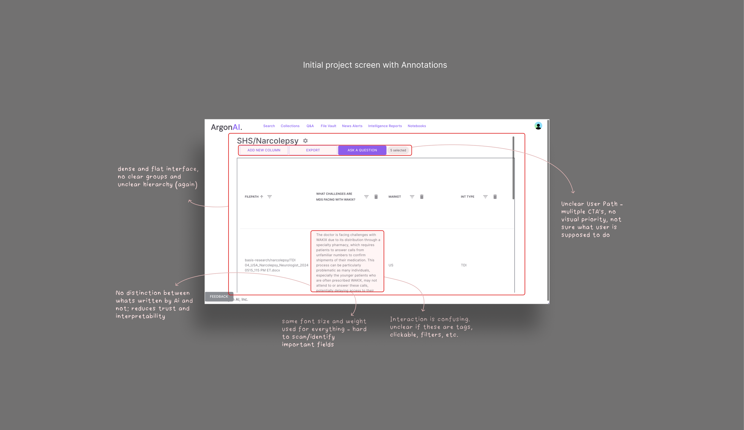
UX Audit
One of the first things I did on the project was perform a UX audit of the MVP. The product had been developed with minimal design input, so the foundational UX was non-existing. Using Jakob Nielsen’s usability heuristics and basic UX best practices, I evaluated the existing interface for areas of friction and confusion.
I determined that the product had no consistent layout system, minimal visual hierarchy, and unclear feedback mechanisms. Basic interaction patterns like navigation, task flow, and even clickable elements were either missing or misaligned with user expectations. Furthermore, nothing in the interface helped users understand or feel confident about what the AI was doing. The overall experience made an already complex tool feel even more intimidating.

Competitor & Industry Research
To better understand what users would expect around research workflows, I looked at similar tools used by both academic and healthcare professionals. Two key products stood out: Elicit and Claude AI. These tools helped clarify for me certain UX patterns that are common in AI-powered research platforms — such as interaction models, tone, and data presentation. While Argon AI’s backend capabilities were unique, these competitors helped shape the design direction in terms of reducing complexity, increasing user trust, and making high-stakes data feel more usable.
It became clear that many competitors were building for themselves, not the broader users they hoped to attract. This helped guide my design process and made me pay special attention to translating these technical / expert-level workflows into more inclusive and intuitive experiences.


How this informs my design
Based on what I learned from Elicit, Claude, and discussions with the founders, the first thing I decided to improve was the search flow. I designed it to be a dropdown-first search instead of a free-text prompt. This gave users a clearer starting point and reduced the ambiguity often associated with AI tools. While the founders wanted a more structured input to improve the quality of AI responses, this interaction also made the tool feel more accessible to new users who might not know what to ask or how to ask it.
I also took cues from Elicit’s modular layout approach, designing interfaces that allowed users to easily access, compare, and explore multiple types of data without jumping between screens. This included the final implementation of a three-quadrant layout where AI summaries, visualizations, and source data could coexist—giving users control and context in the same view.
Lastly, I incorporated hierarchy and UI patterns that have become familiar in modern AI tools: clear headings, warm prompts, helpful examples, and a calm, structured aesthetic. These elements are not only stylistic, but also helped to establish user trust and reduced friction.
Design System - Material Design 3
After analyzing our competitors I began developing a modular design system that could scale with the product while supporting fast iterations and implementation.
The system included color, typography, iconography, components, and layout foundations — all tailored to the needs of a dense, data-driven interface. I also worked closely with developers to ensure I was aligning my decisions with Material UI (the framework they were using). This informed several of my design decisions and led to adjustments during handoff.
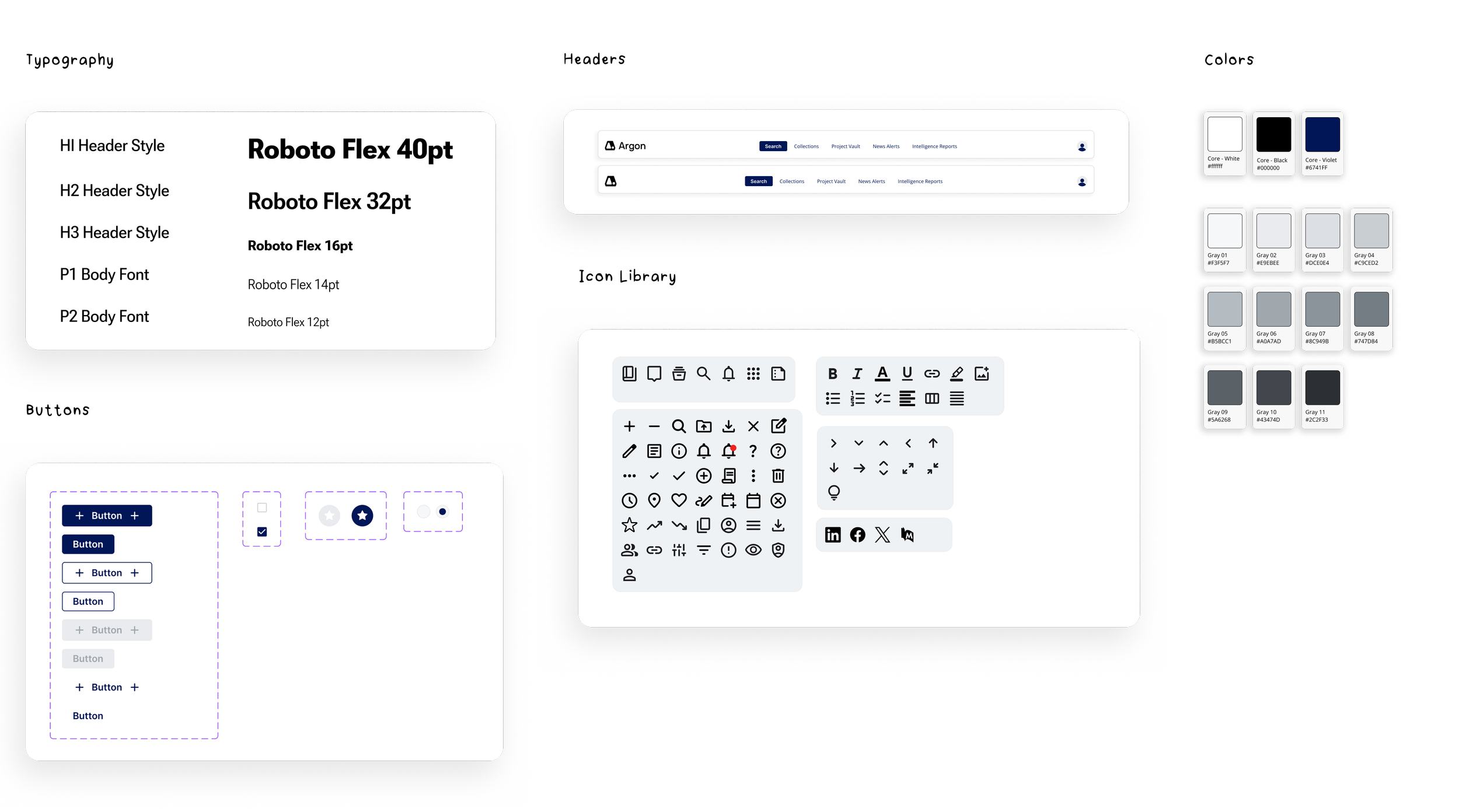
Mid-project, the team brought on developers who chose to implement Material Design 3 via Material UI. Up until that point, I had full freedom over the visual direction — from color palette to typography — and built the early design system accordingly. However, when engineering identified the stack they would be using, I had to pivot and align the system with these requirements. This meant updating type styles to use Roboto Flex, replacing my custom grays with Material UI’s predefined color tokens, and ensuring components were mapping cleanly. It took about a day to update the entire platform because of my already implemented system, and then the project moved forward seamlessly.
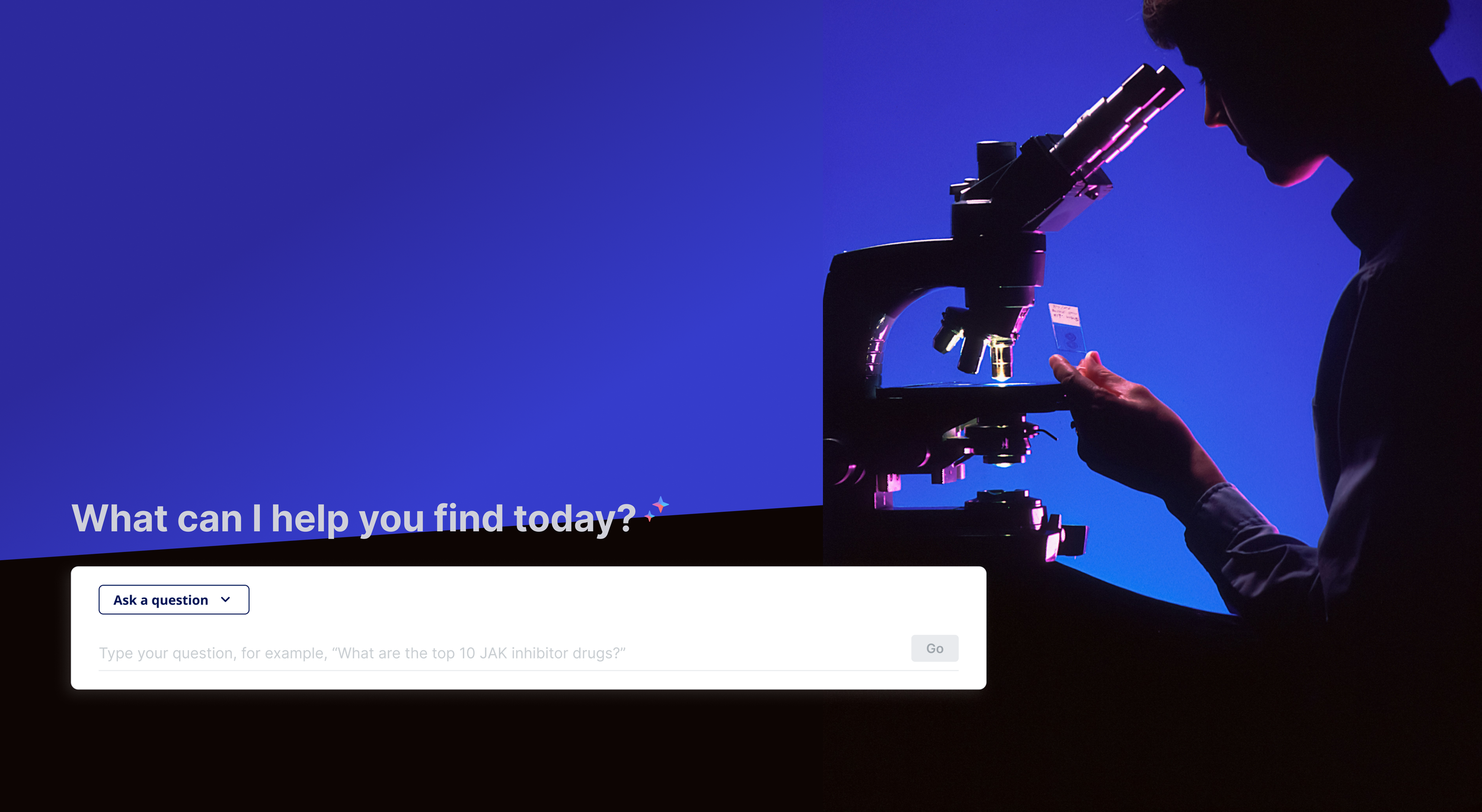
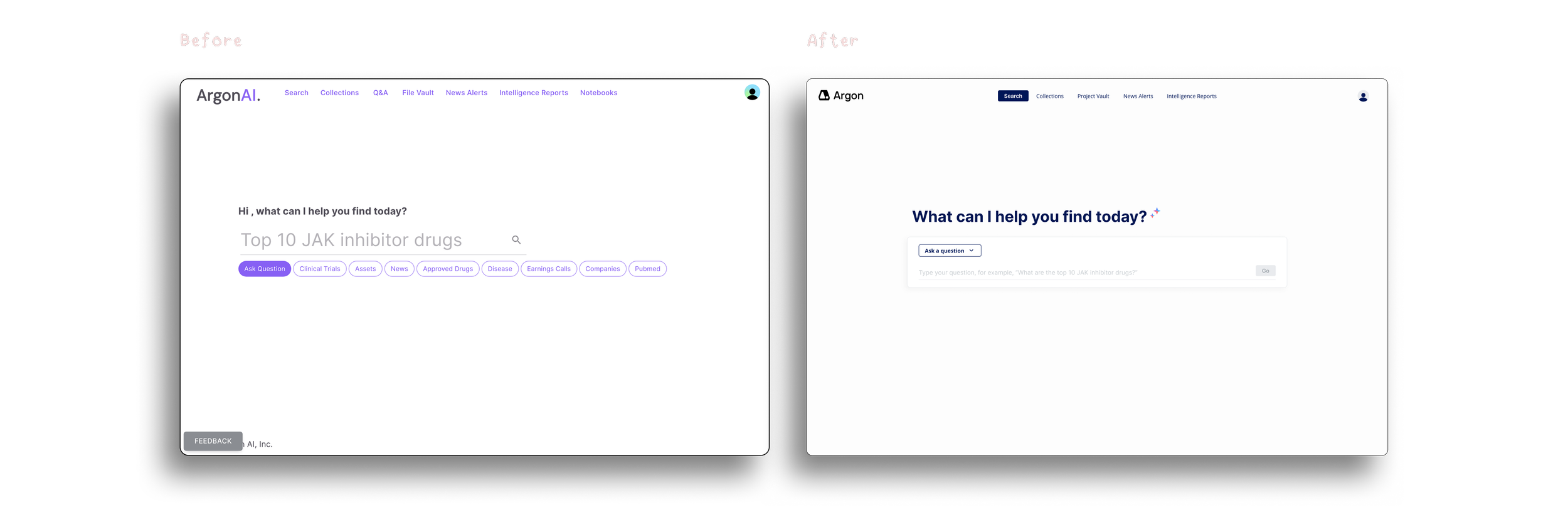
Final Designs - Restructuring the entry point
I redesigned the initial AI screen to feel more guided, trustworthy, and user-friendly. Instead of a free-text prompt, I introduced a structured dropdown to help users better frame their questions. This made the tool more approachable — especially for new users — while also helping ensure the AI received more precise input.
Visually, I cleaned up the layout using the new design system: typography hierarchy, consistent spacing, and modular elements. This screen became the foundation for all future interactions with Argon’s AI.

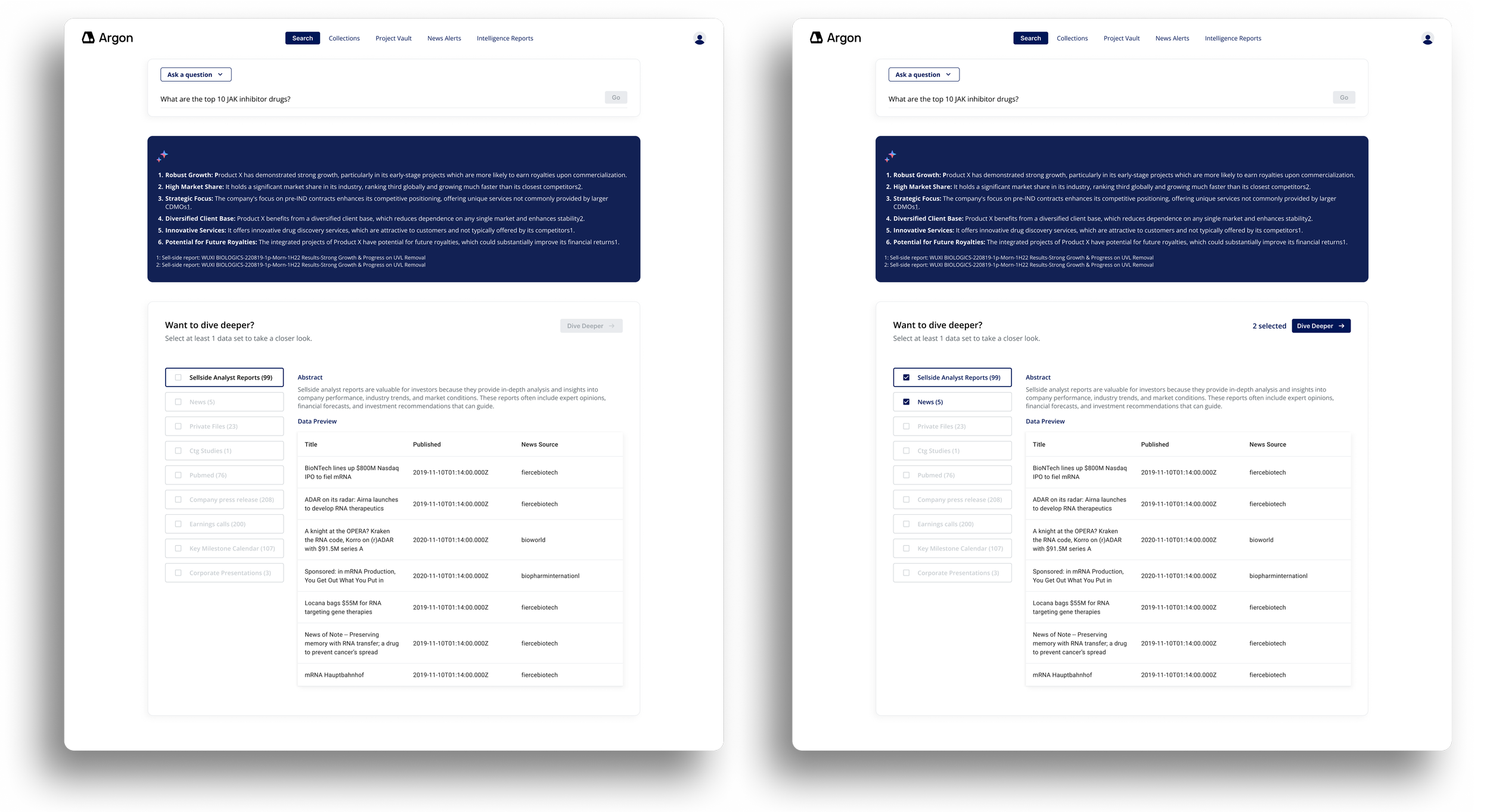
New Feature: Selecting Data Sets
As the product evolved, the team identified a need to give users more control over the sources powering the AI responses. If the user wants a simple AI answer, they will get it, however if the user wants to “dive deeper” and select specific data sets — such as analyst reports, news, or clinical studies — to ground the AI’s answers in verifiable sources, they can do so,
I designed this interface to be flexible and clear: filters are organized by category, selections are visually updated, and the “Dive Deeper” button becomes active only after a user selects at least 1 data set. Users can also read a short abstracts of each data set they are choosing, so they aren’t expected to memorize all of the data they upload.
Overall, this new step in the user flow made the product a more transparent, trustworthy AI experience.
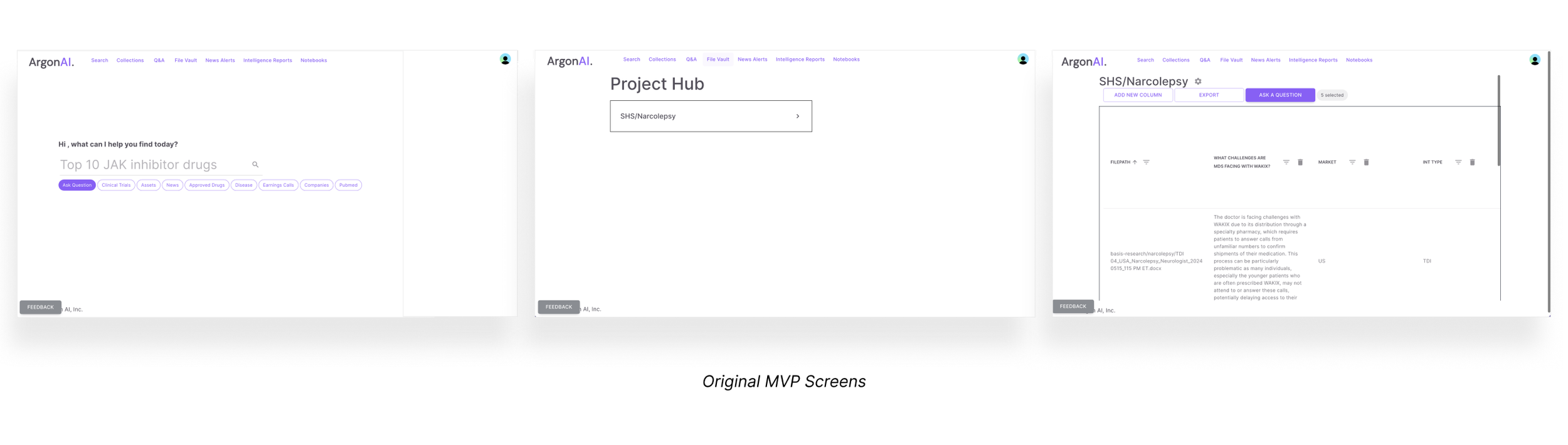
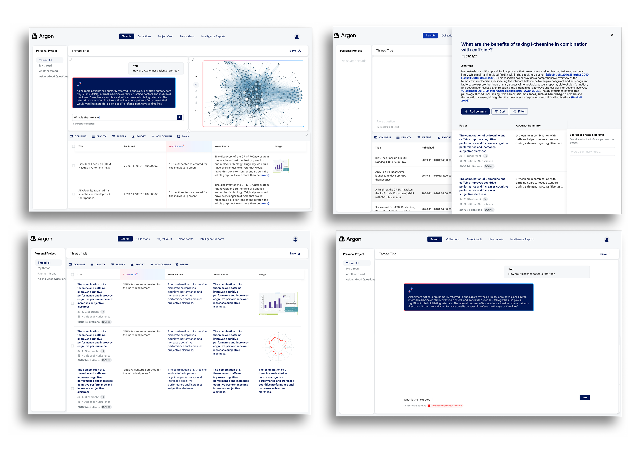
Final Designs: Project View Screens

One of the biggest shifts in the platform redesign was how users interacted with their saved work. In the original MVP, the "project" screen was essentially a static table with minimal functionality. We completely reimagined it into a dynamic, modular workspace where users could:
View source data
Ask AI-powered questions
Visualize results
And iterate all within one cohesive flow
The new workspace features three resizable and collapsible modules:
Data table (source content)
AI-generated insights
Visual outputs
This allows users to customize their layout depending on whether they’re writing a report, diving into research, or sharing visuals.
We also introduced an “Add Column” panel, which lets users ask new questions mid-project. The AI scans the selected data, returns relevant results, and previews how this new insight would appear before it’s added to the table. This feature encourages iterative exploration, while keeping the interface focused and minimal.
Reflections & What I would Do with More Time
While we didn’t conduct formal usability testing during this project, we iterated quickly based on regular feedback from the founders and the evolving technical constraints. In many ways, the work was shaped more by startup realities than a linear process. If I had more time, I would have prioritized testing key flows — especially the structured AI query system and multi-panel workspace — to better understand how first-time users navigate and interpret these tools.
That said, this project gave me plenty to reflect on:
Designing in a domain I didn’t understand (yet)
I came into this project with no background in biotech or healthcare AI. I had to get comfortable asking a lot of questions, simplifying complex material, and continuously reframing what “useful” looked like from the user's perspective. This helped me become a stronger systems thinker and communicator.Rolling with product pivots
When developers were brought in midway and chose Material UI as the design framework, I had to rework parts of my visual system — including replacing custom grays and adapting patterns to match MUI’s constraints. It was a good lesson in collaboration and letting go of ideal solutions in favor of feasible ones.The value of modular thinking
From the beginning, I designed for flexibility — knowing the product was still evolving. That decision made it easier to accommodate new features like the “Select Data Sets” step, which wasn’t part of the original MVP.Designing with and for AI
One of the core UX challenges was helping users get more signal than noise from the AI. We landed on a structured query flow that gave the model more context — but also made the interface more approachable and less prone to confusion. It reminded me that good AI UX isn’t just about flash — it’s about setting the user up to get meaningful outcomes.
THE END - THANKS FOR READING