
Project Overview
Client: Integritag (formerly known as Cloud) backed by All4Labels Global Packaging Group
Role: UX/UI Designer
Duration: Nov 2022 - Feb 2024**
Team: Myself, Lead Product Designer, CEO, 6 Developers, 3D Illustrator
** I worked on this project from late 2022 through early 2024, contributing to different phases — starting with early brand exploration, then building a design system, crafting illustrations, designing the landing page, and supporting UI work as the platform evolved.
The Problem
When I joined the team, they had the bare bones of a product in place — a rough MVP that functioned, but just barely. The UI felt clunky and outdated, there was no visual hierarchy, and no design system to bring consistency or structure to the experience. It was clear the platform needed a complete refresh — both in how it looked and how it communicated what it did.
Because we were an offshoot of All4Labels, a large global packaging company, we weren’t starting from a completely blank slate. One key constraint was that our UI needed to stay visually aligned with All4Labels’ brand — which meant working within certain color ranges, typography choices, and overall aesthetic guidelines. That added an extra layer of complexity: how do you build a fresh, modern identity that still fits within an existing ecosystem?
On top of that, the product itself — and the brand — were evolving rapidly. The company name changed multiple times during my time there, and the core offering kept expanding. That meant our design work had to stay flexible and scalable, while still creating a strong first impression.
The Challenges
Outdated MVP UI: The experience looked unpolished and didn’t reflect the platform’s potential.
Evolving brand identity: The name, positioning, and tone were all still taking shape.
Parent brand constraints: We had to stay visually connected to All4Labels, while still defining our own identity.
Unfortunately, I didn’t have access to the original designs when putting this case study together — but imagine a bare-bones MVP with early 2000’s UI, inconsistent layouts, clashing type styles, and no visual system to tie things together.
Brand Exploration & Mood-boarding
Before jumping into UI, I started by exploring what the brand could feel like. Since the product itself — and even the company name — was still in flux, these early visual explorations helped us find a tone of voice and aesthetic direction we could build on.
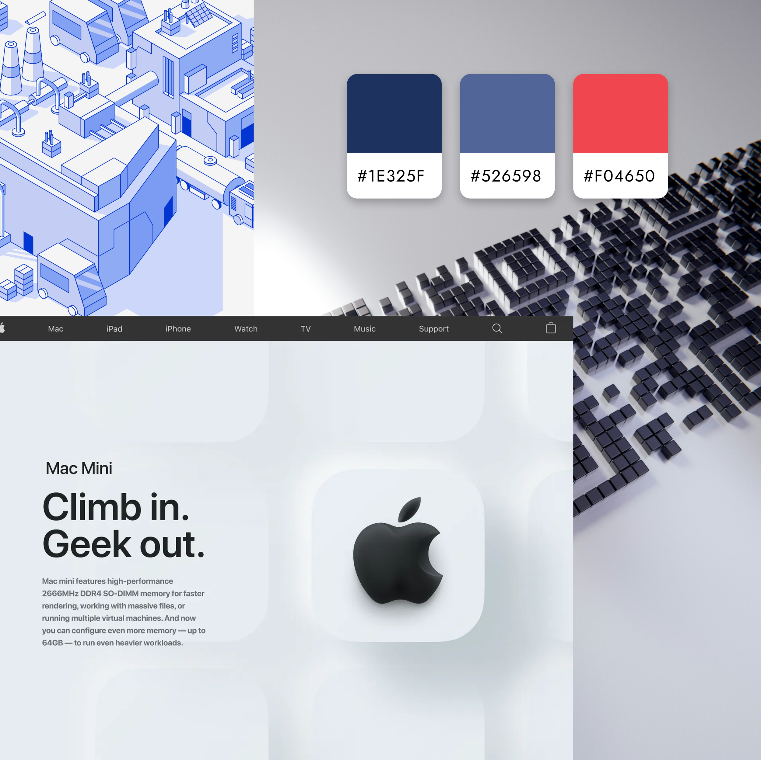
The CEO consistently referenced Apple’s product UI as a north star: clean, minimal, and focused on clarity. That gave me a clear visual target — something modern and professional, with lots of white space, tight visual hierarchy, and subtle polish.
At the same time, I explored a few different color directions that felt more tech-forward and fresh, experimenting with palettes that balanced energy and trust. But ultimately, because we were building under the All4Labels umbrella, we needed to move forward with their core brand colors:
Dark navy blue
Bold red
Light navy blue
It was a challenge, these weren’t the colors I would have picked for a minimalist UI, but it pushed me to work within a tighter visual system.
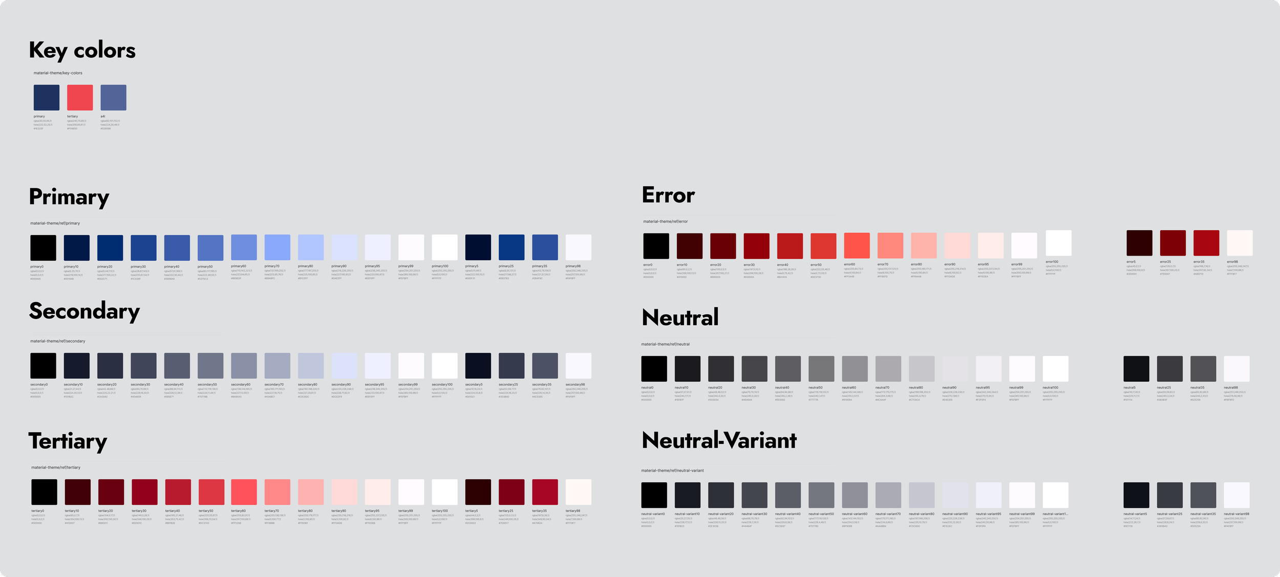
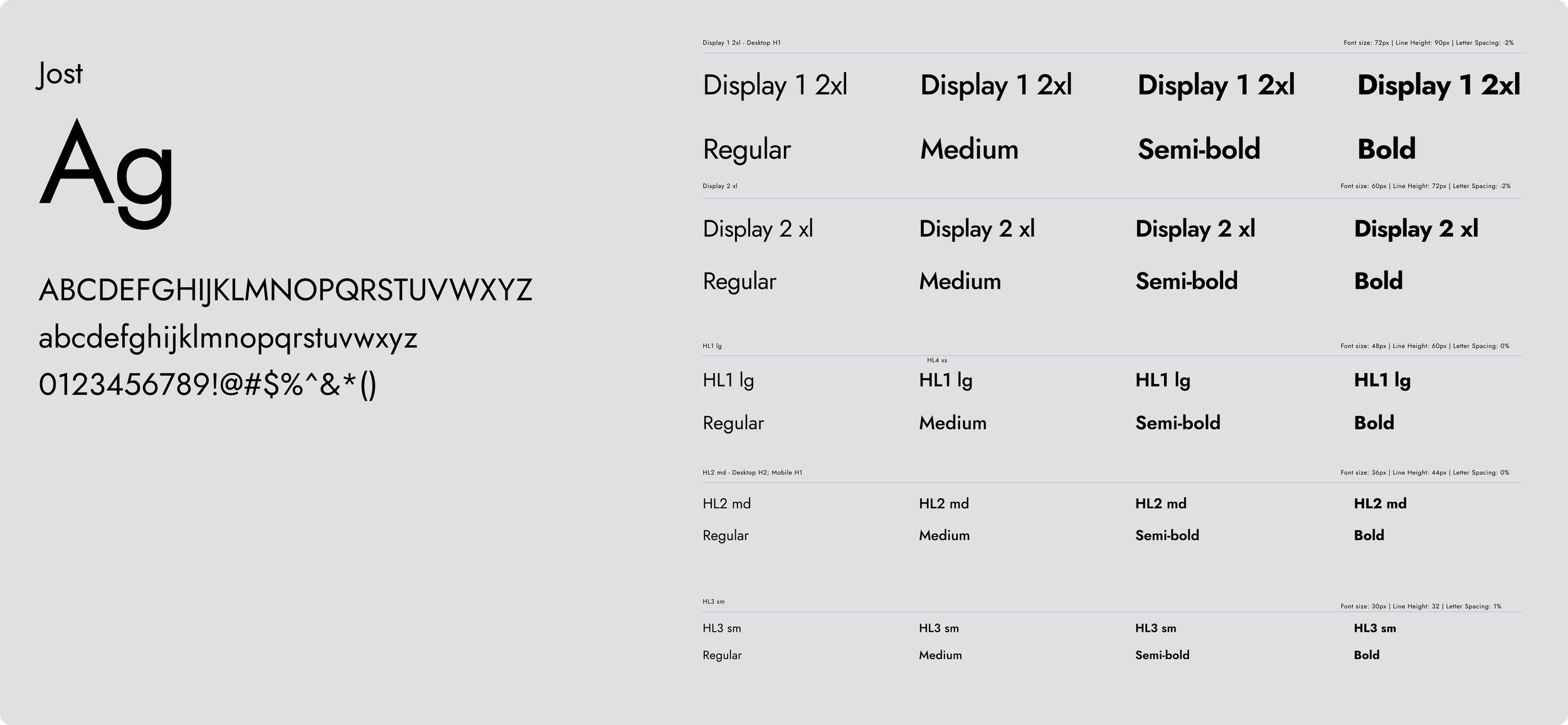
Foundations: Color, Type, and Core UI
Once we aligned on the brand direction, I started building out the design system from scratch.
This was actually the first design system I had ever created, so it was a huge learning experience. I was teaching myself as I went, and absorbing all I could from the Senior designer I was working under. This process pushed me to think beyond how things scale. For the first time I was considering how designs would be applied throughout the product, how they would scale, and how we would use them as the project progressed. This was a crucial step in shaping the design process I currently utilize.
Creating this design system at the beginning was a lot of upfront work, several months without progressing on the actual product. However once we got a working design system, it allowed us to progress exponentially while painting a consistent product. This is something I take into my current work. I spend time upfront to develop a system from which I can build a cohesive product seamlessly.


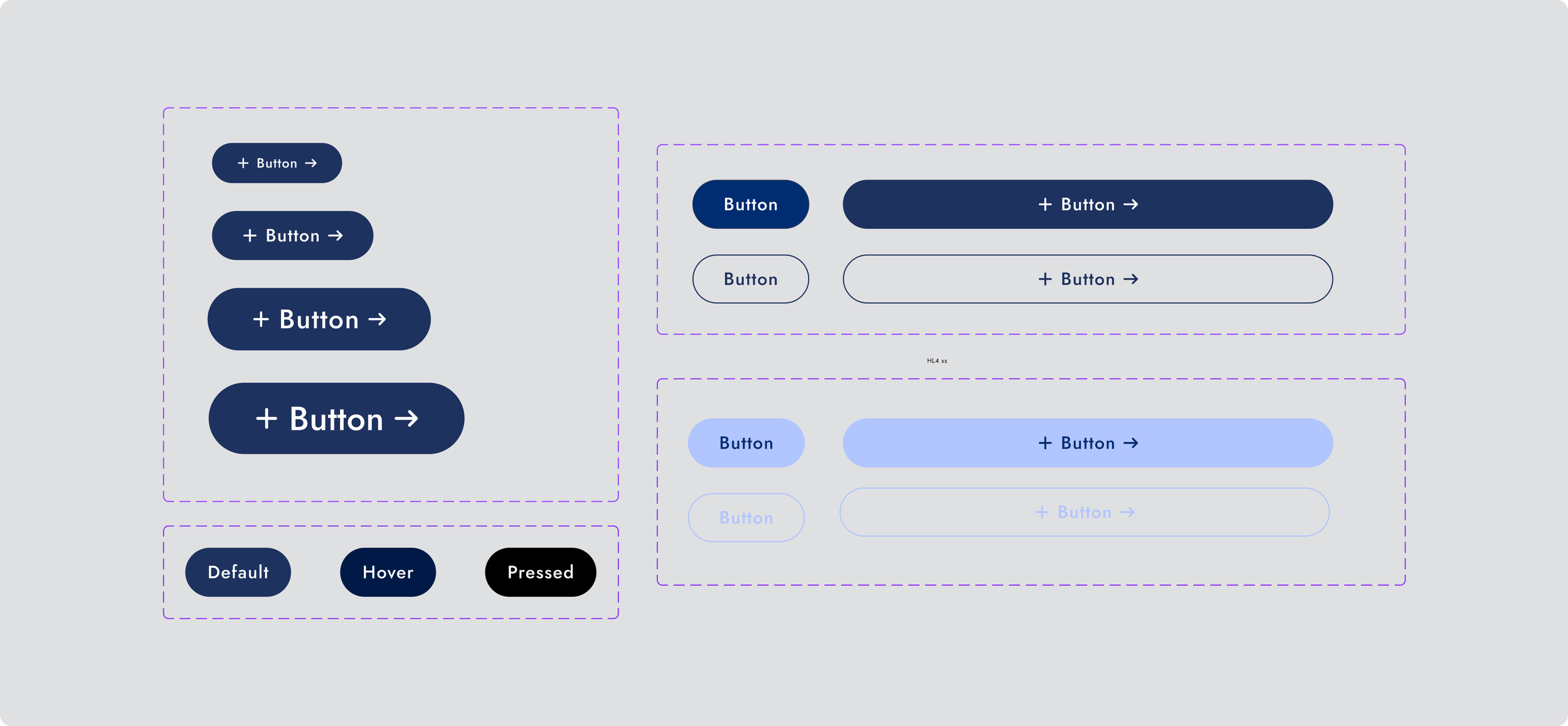
Components & Interaction Patterns
With the core foundations in place — color, typography, spacing, and core UI elements — the next step was translating those decisions into a reusable system.
Rather than designing screens in isolation, I focused on building flexible components and interaction patterns that could scale across the marketing site, web platform, and native app experiences. This included navigation, form inputs, tables, modals, and other core UI patterns used throughout the platform.

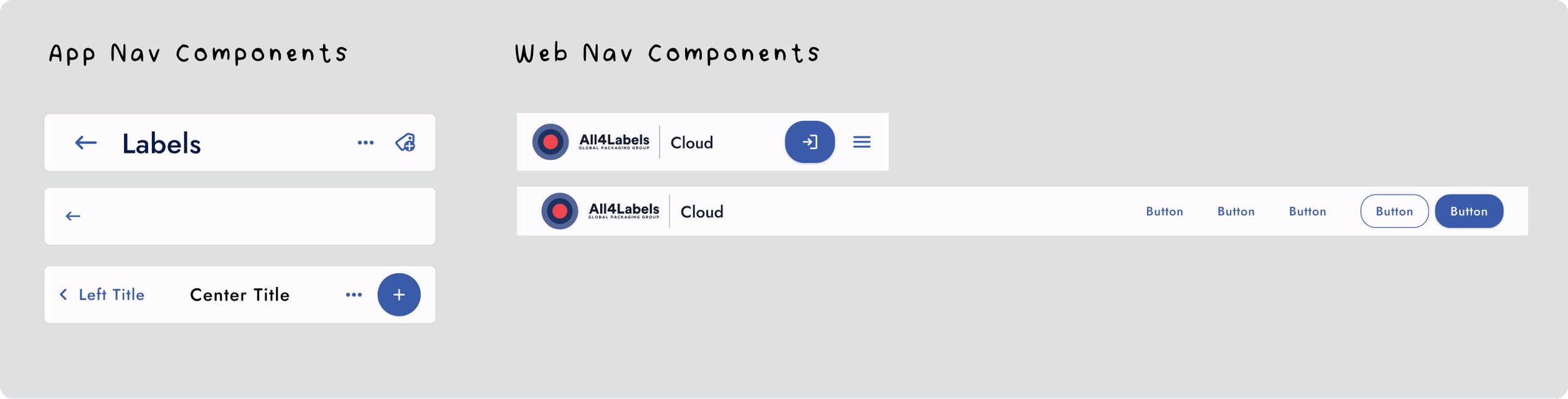
Designed as modular components that could be reused across multiple workflows and screen sizes.

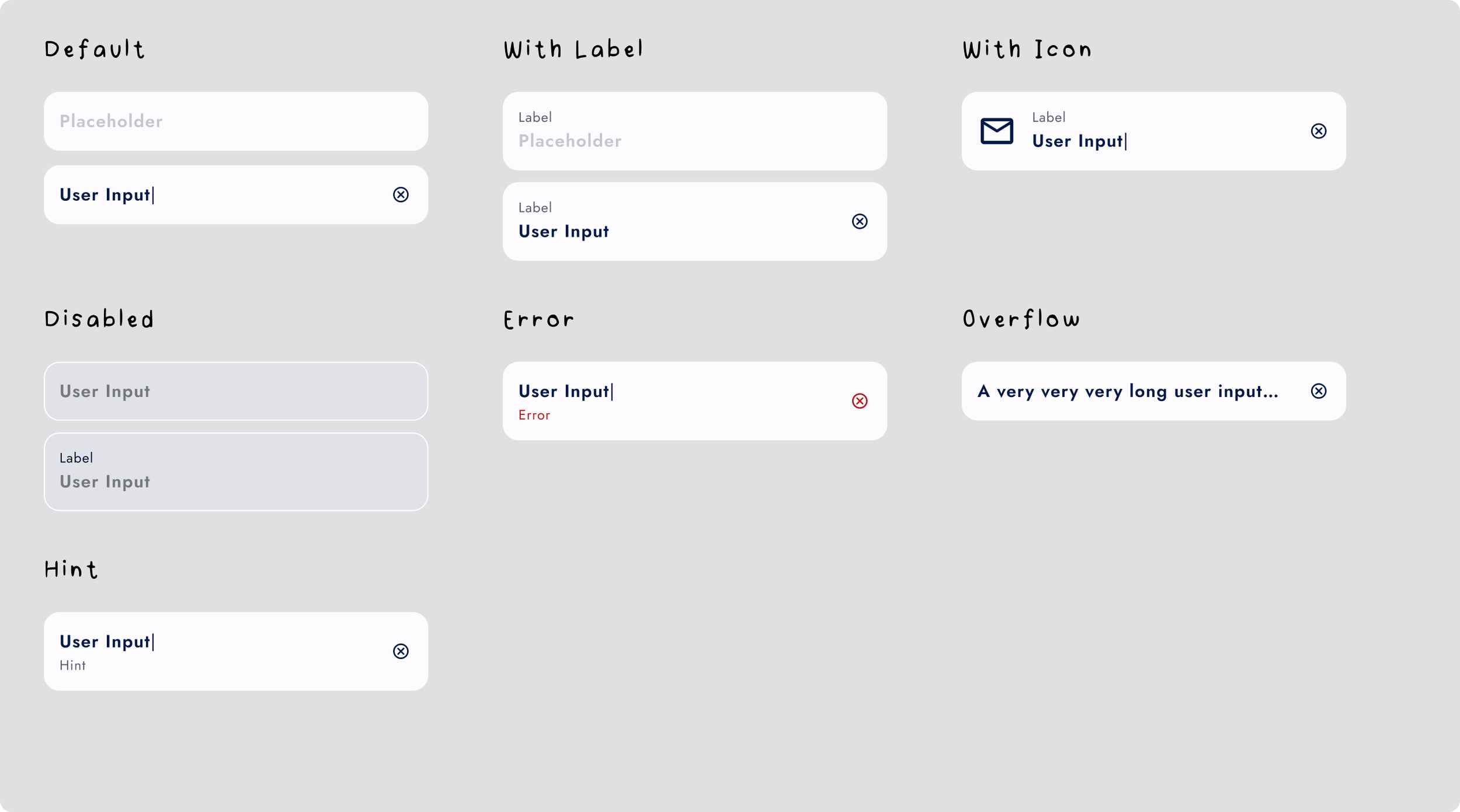
Designed with flexible labeling, icon support, validation states, and overflow states.

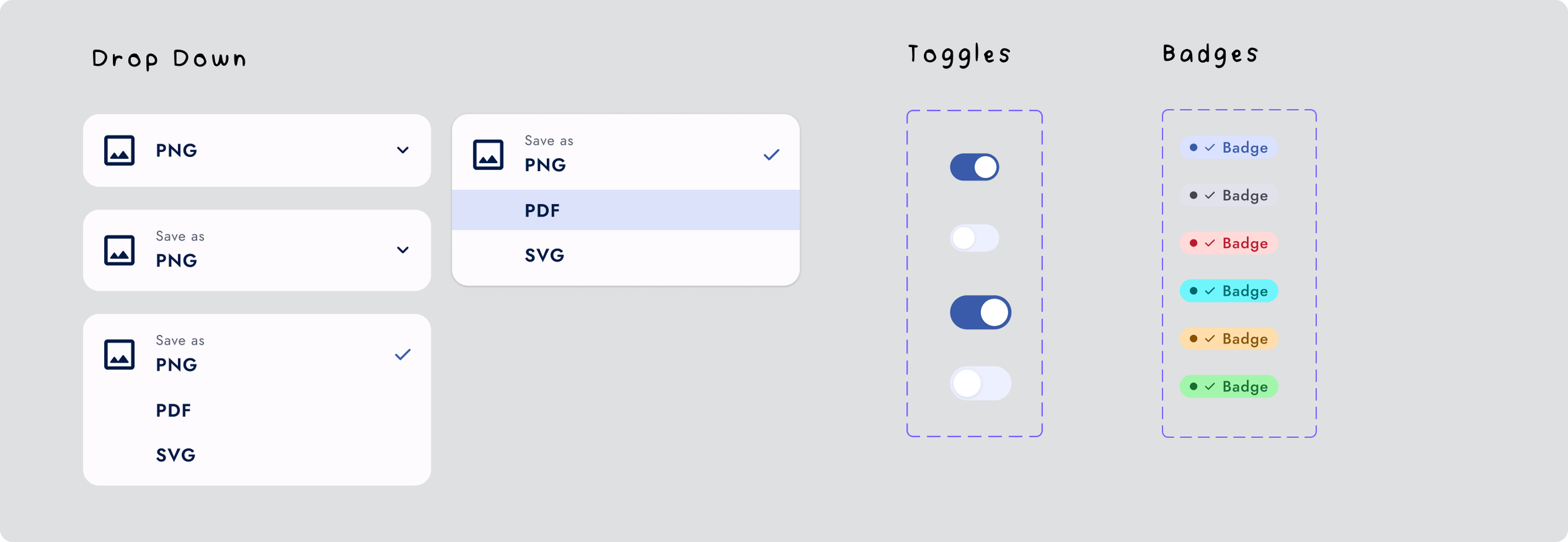
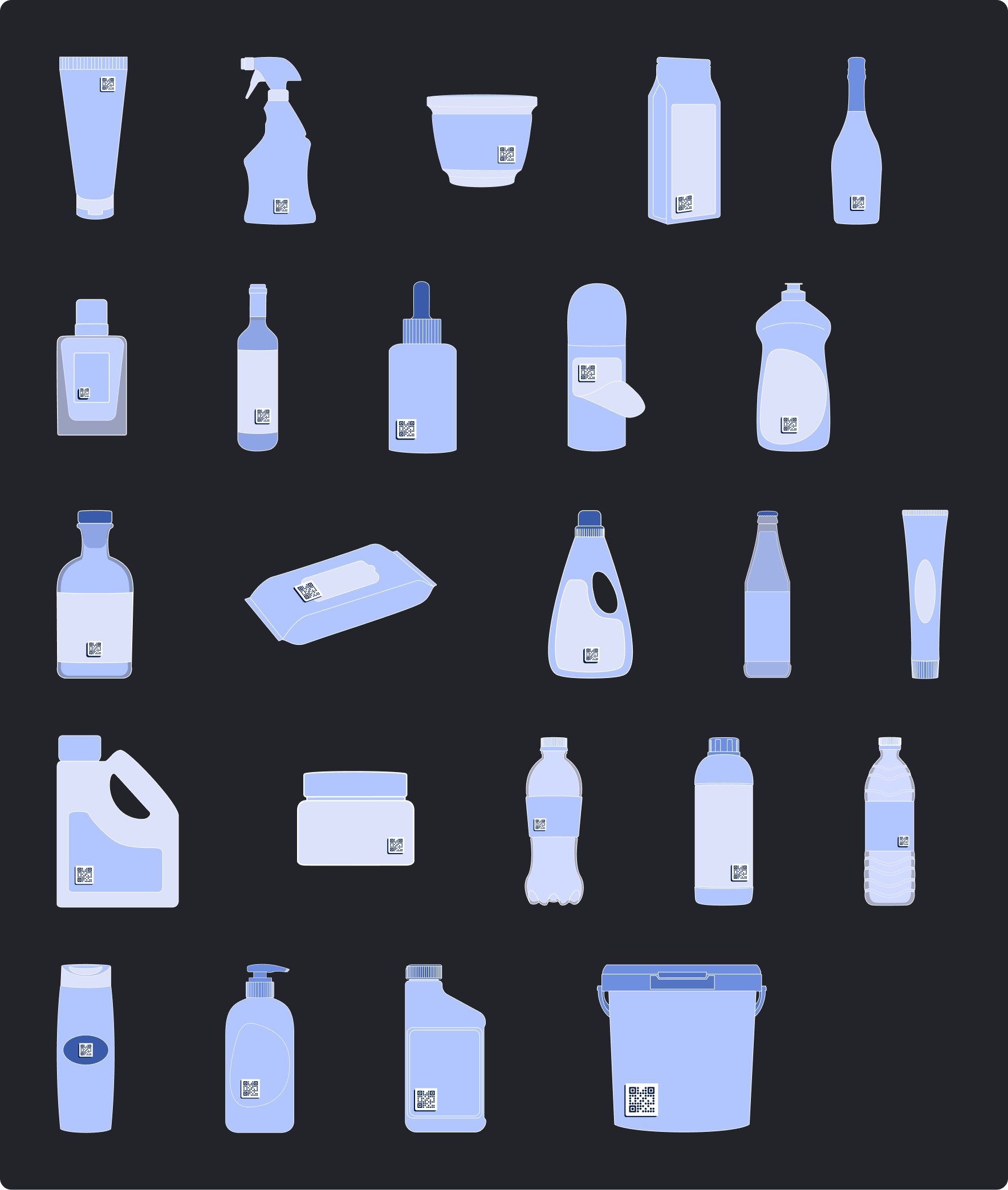
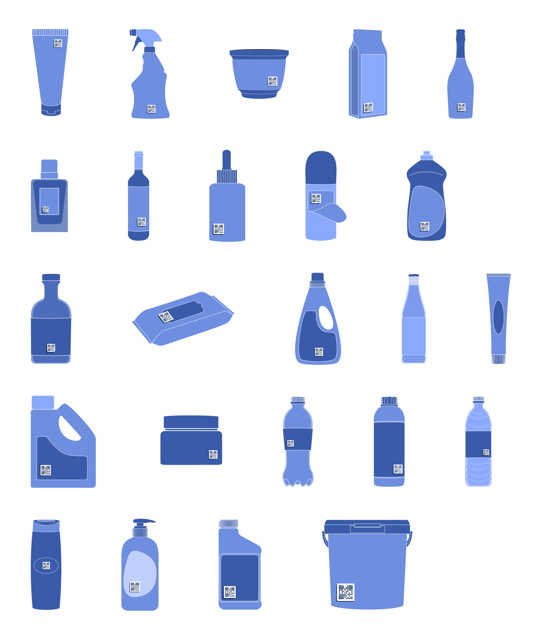
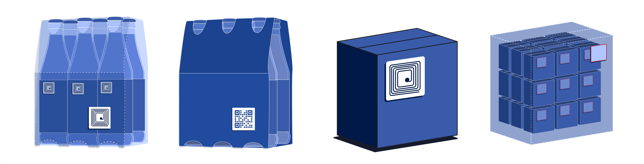
Illustration & Product Visualization System
Because the platform centered around generating QR codes for physical packaging, we needed a way to visually demonstrate how those codes would exist in the real world.
I developed a scalable illustration system that represented a wide range of packaging formats — bottles, boxes, multipacks, containers, cosmetics, and more — each designed to showcase how QR codes could be applied across different vessels and use cases.
The style intentionally mirrors the UI system — minimal, geometric, and color-restrained — ensuring the illustrations felt like an extension of the product rather than decorative assets. Every illustration was also created in both light and dark modes.
In total, I designed 50+ custom illustrations and product visuals, building a cohesive system that helped communicate complex workflows — from QR generation to scanning, analytics, and authentication — in a clear, approachable way.


Impact & Outcomes
By establishing a foundational design system and scalable illustration language, we transformed a fragmented MVP into a cohesive, production-ready platform.
The system enabled:
Faster feature expansion across web and app
Consistent branding under the All4Labels umbrella
Clear visualization of complex QR and RFID workflows
Smooth collaboration with developers and 3D artists
What began as a visual refresh evolved into a scalable product foundation that supported the platform’s rapid growth and rebrand.
What this project taught me
This was the first full design system I built from the ground up, and it fundamentally changed how I approach product design. Now I understand the impact of prioritizing structure, scalability, and systems thinking before polishing up single screens.
Today, I lead projects by first building a solid foundation, then moving on to all the other fun stuff.
