Project Name: Maison PDP & Megavigation Redesign
Client: “Maison” (a premium London-based furniture retailer – pseudonym used for confidentiality)
Platform: Responsive e-commerce site (Desktop, Tablet, Mobile)
Duration: 2 weeks
Role: UX/UI Designer – Subcontracted Design Support
Project Overview
I was brought in to provide subcontracted design support to the in-house UX design team at Maison, a premium London-based furniture retailer. The team was facing tight deadlines and needed some focused help to redesign two high-impact areas of the site:
Product Detail Page (PDP) — struggling with usability, clarity, and conversion
Global Meganavigation — cluttered and hard to scan, making product discovery difficult
My solutions aimed to increase conversion rates, clarify product details, and improve the overall information architecture.

Original Meganav and PDP
I joined the Maison project as a freelance UX designer to support the internal team during a tight sprint. I was excited to be part of this project because e-commerce UX is an area I’m deeply passionate about—specifically helping users make confident purchasing decisions.
While my involvement was subcontracted and informal, I collaborated closely with the internal team to align on usability priorities and deliver focused and actionable design solutions. My work was grounded in heuristic best practices, responsive design considerations, and Maison’s customers’ in-store experiences.
My Role & Collaboration
Project Goals
Increase conversion rate on product pages
Reduce cart abandonment caused by unclear options or inventory
Improve site IA and product discovery through clearer more scannable meganavigation
Align the online experience with Maison’s brand: elevated, curated, and service-driven
Support SEO and customer trust with better product structuring and availability cues
Project Goals & Success Indicators
Expected Outcomes
At the time of writing this, the redesign has not gone live. These are projected outcomes based on UX best practices and stakeholder alignment.
Increase conversion rate on product pages
Support SEO and customer trust with better product structuring and availability cues
Improve product discovery through a more structured, scannable meganavigation
Align the online experience with Maison’s brand: curated, premium, and service-driven
Understanding user context was essential to defining where to begin.

Meet Clara: Maison’s Core Customer
To ground the design process in real user needs, I created a primary persona based on Maison’s target audience: urban, design-savvy professionals furnishing their homes with premium items.
Clara Lin represents this core demographic. She’s a time-strapped creative professional who values elevated design, but expects a smooth and transparent digital experience
Her needs shaped our design decisions throughout this project.
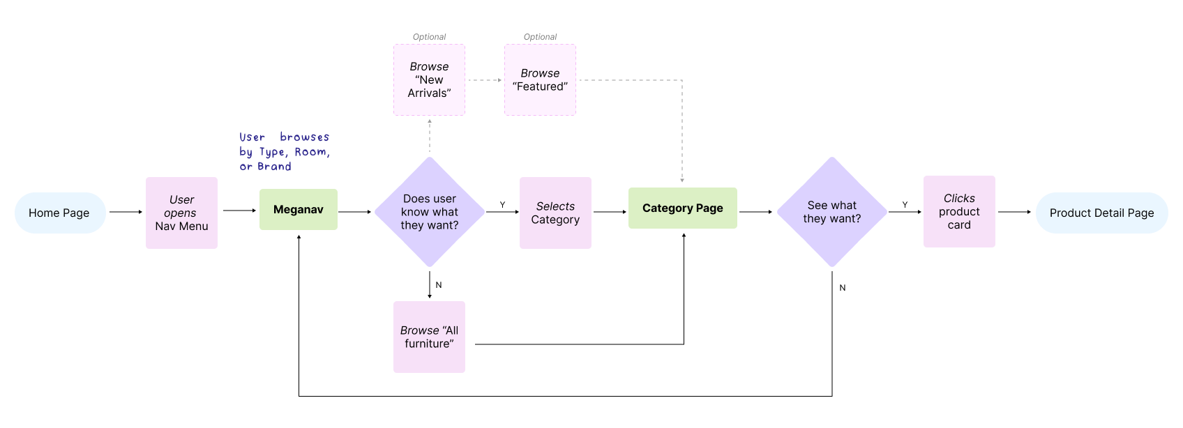
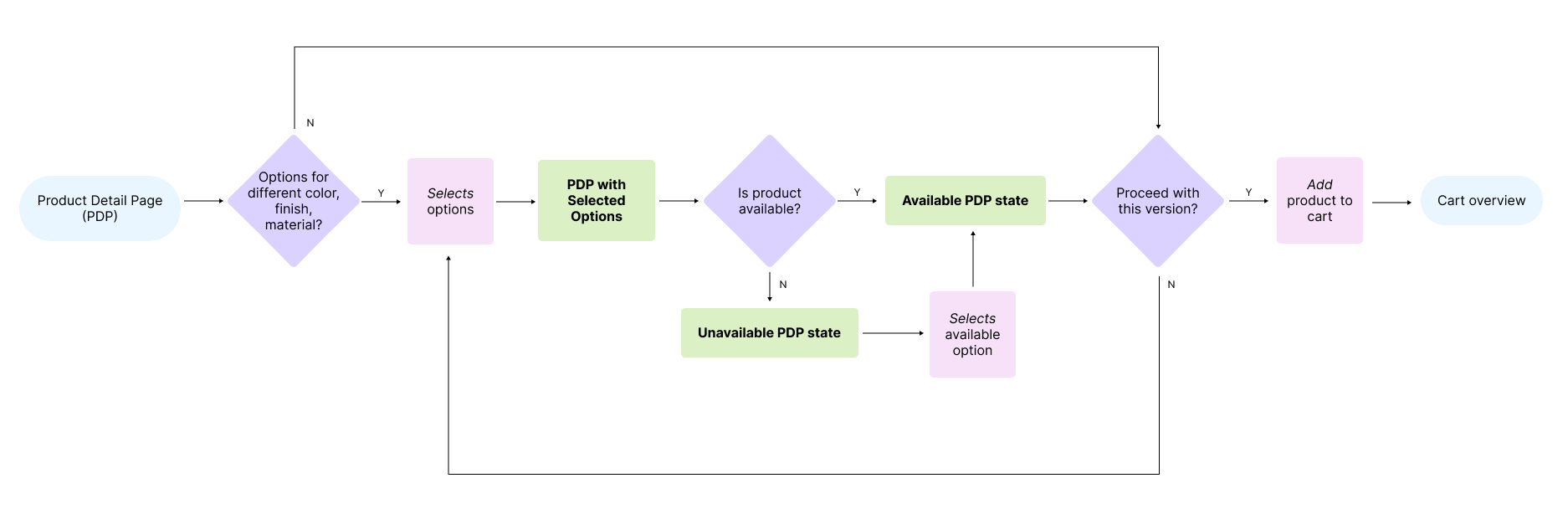
Before diving into design, I mapped out the core user journey through Maison’s site—from homepage navigation to product configuration and cart. This flow helped identify high-friction areas where users like Clara might drop off or get overwhelmed — product selection, variant clarity, and overall information architecture.
I focused on two flows in particular:
Entry to Product Discovery via navigation and featured content
Product Configuration to Add-to-Cart via the PDP
User Journey & Flow Mapping
The Challenge : Part I - Meganav
Maison’s e-commerce experience already had strong branding and high-quality product photography, but they struggled in areas that are critical to the user purchasing experience.
When it came to selecting options or checking availability, customers found the digital experience dense, confusing, and difficult to navigate.
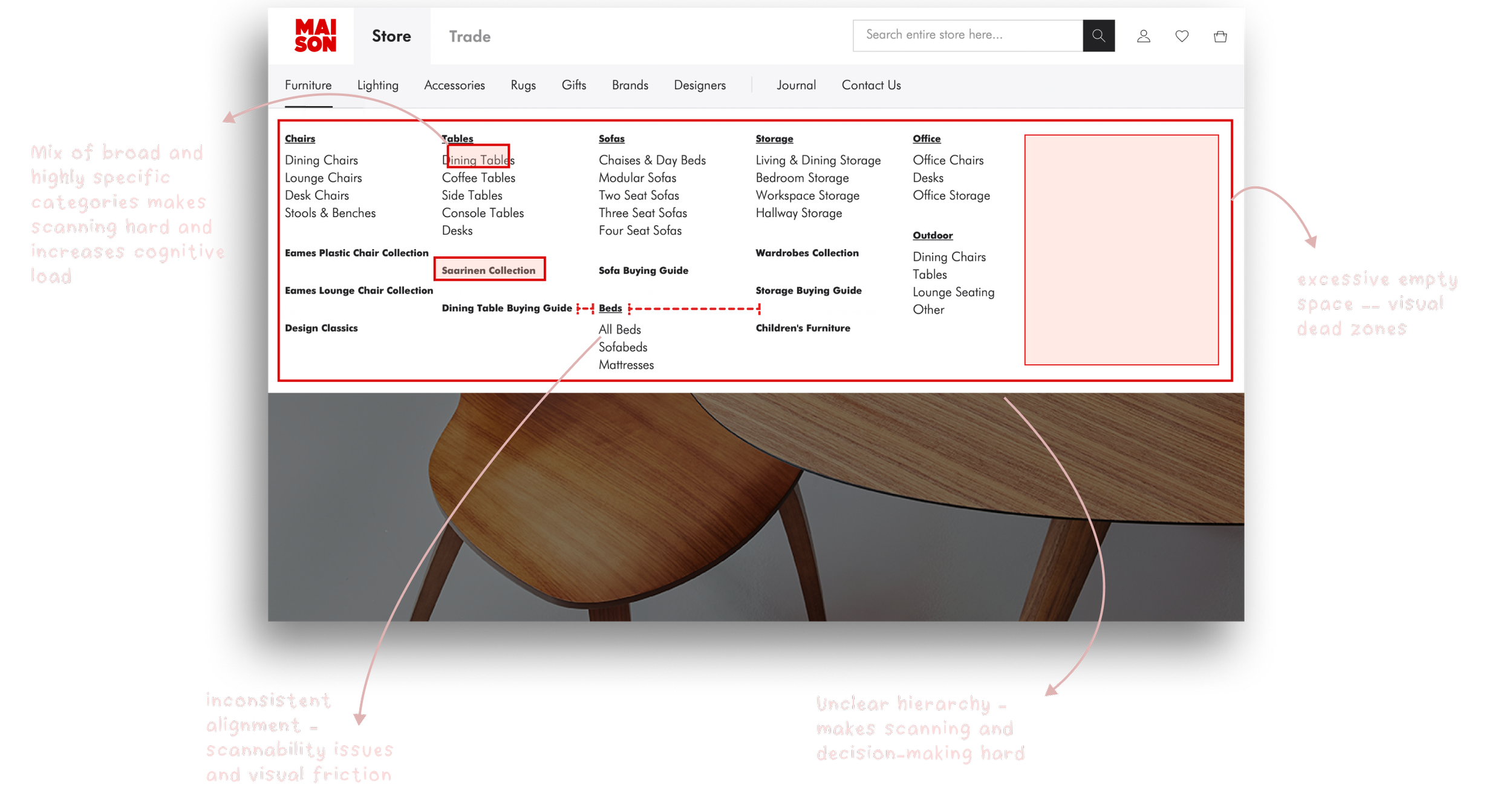
Through a heuristic evaluation and an informal discussion with the team, we identified several key issues:
The meganav is, overall, being underutilized. Despite its prominence on the site, it’s missing the opportunity to guide users through featured content or curated collections.
The meganav presents an overwhelming list of categories. It mixes broad and highly specific labels and offers no clear groupings or visual aids. This is making product discovery inefficient.
Original Meganavigation Design With Annotations
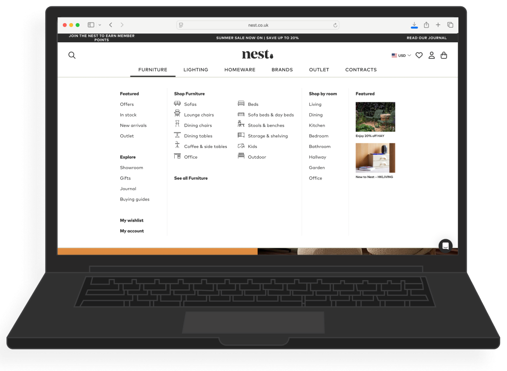
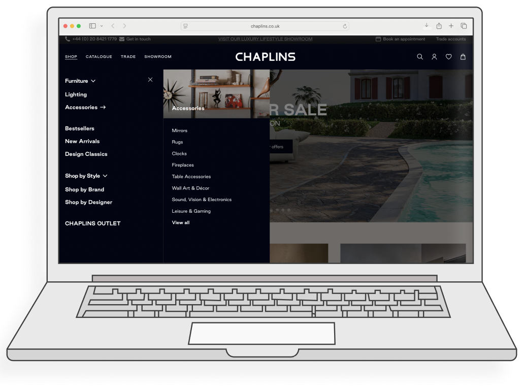
To help guide the redesign, I analyzed navigation patterns across leading furniture and lifestyle e-commerce sites — including Nest, twentytwentyone, and Chaplins. These references revealed several consistent UX principles:
Intuitive category groupings that reduce scanning time
Visual aids (like icons or imagery) to enhance comprehension
Editorial or featured content to support product discovery and brand storytelling
What’s working elsewhere

Solution: Part I - Redesigning the Navigation
After looking at our competitors it was clear Maison’s meganavigation needed to be more clear, consistent and intentional.
Clear and intuitive discovery: I defined key channels which users could shop by: type, room, color and brand. These clear categories remove any uncertainty users may have had about the IA of the site.
Consistent alignment & hierarchy: I enforced consistent alignment and text hierarchy so the eye can naturally scan and explore the menu.
Curated Discovery: I included a dedicated area for Maison to highlight categories they want users to explore, such as “New Arrivals” or “Featured”. This helps created a more intimate shopping experience, like you would find if you were shopping in store.
Visual Cues: I added images and custom icons helps break up the text-heavy lists. This makes the navigation easier to scan and more engaging at a quick glance.
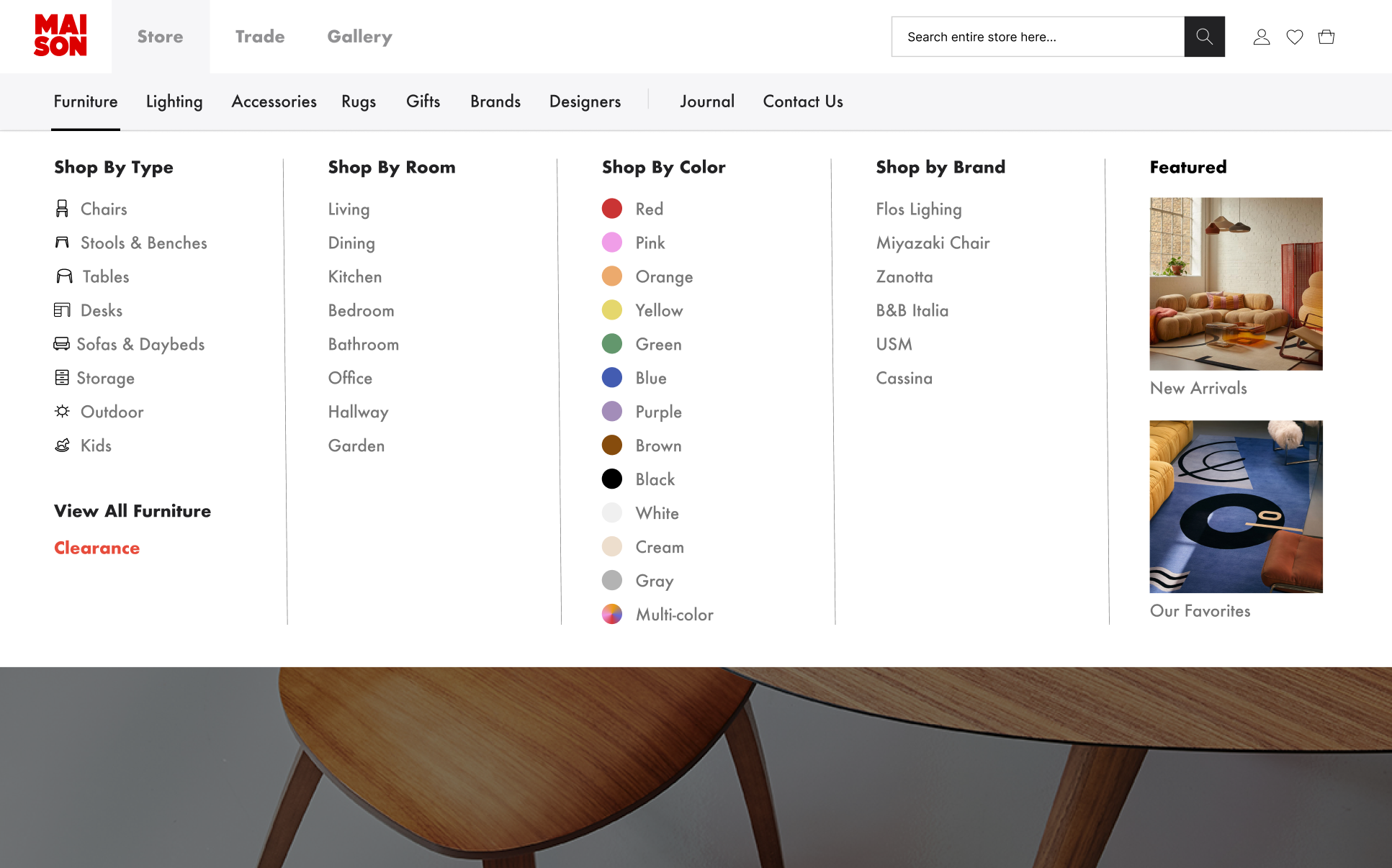
Redesigned meganavigation with clearer categorization, icon support, and balanced layout. Discovery is now supported through curated entry points and better visual hierarchy.
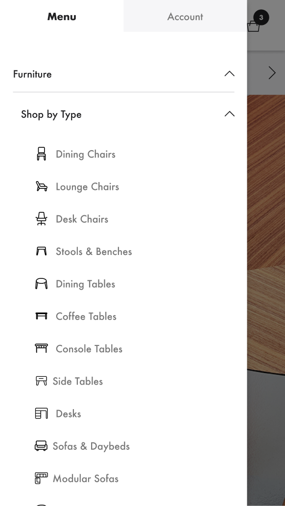
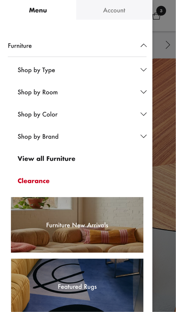
Meganav Redesign on Mobile
Meganav Redesign on Tablet


The Next part of Maison’s site that had the most user pain points, was the Product Detail Page. We concluded that:
The PDP lacks visual hierarchy. This was making it hard for users to understand what they were selecting (e.g., finish, base, upholstery), which are critical steps in the purchasing process.
Stock status and delivery logic on the PDP is unclear. Users who are uncertain about availability and fulfillment timelines will often not continue with their purchase.
The Challenge: Part II - PDP

Original Product Detail Page Design With Annotations
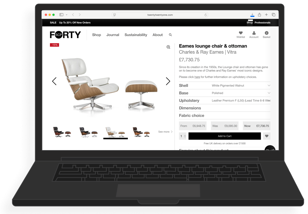
What’s working elsewhere
I reviewed PDPs from leading design retailers like Viaduct, Forty, and Chaplins and noticed a few patterns:
Clean hierarchy and layout — Clear titles, logical spacing, and concise product info help users orient quickly.
Compact configuration tools — Customization (like material/finish) is presented simply, usually in a single, scrollable block.
Stock and delivery info is upfront — Users don’t have to hunt for availability or wait times.
Large scale images — Help replicate the in-store feeling an make users more comfortable purchasing


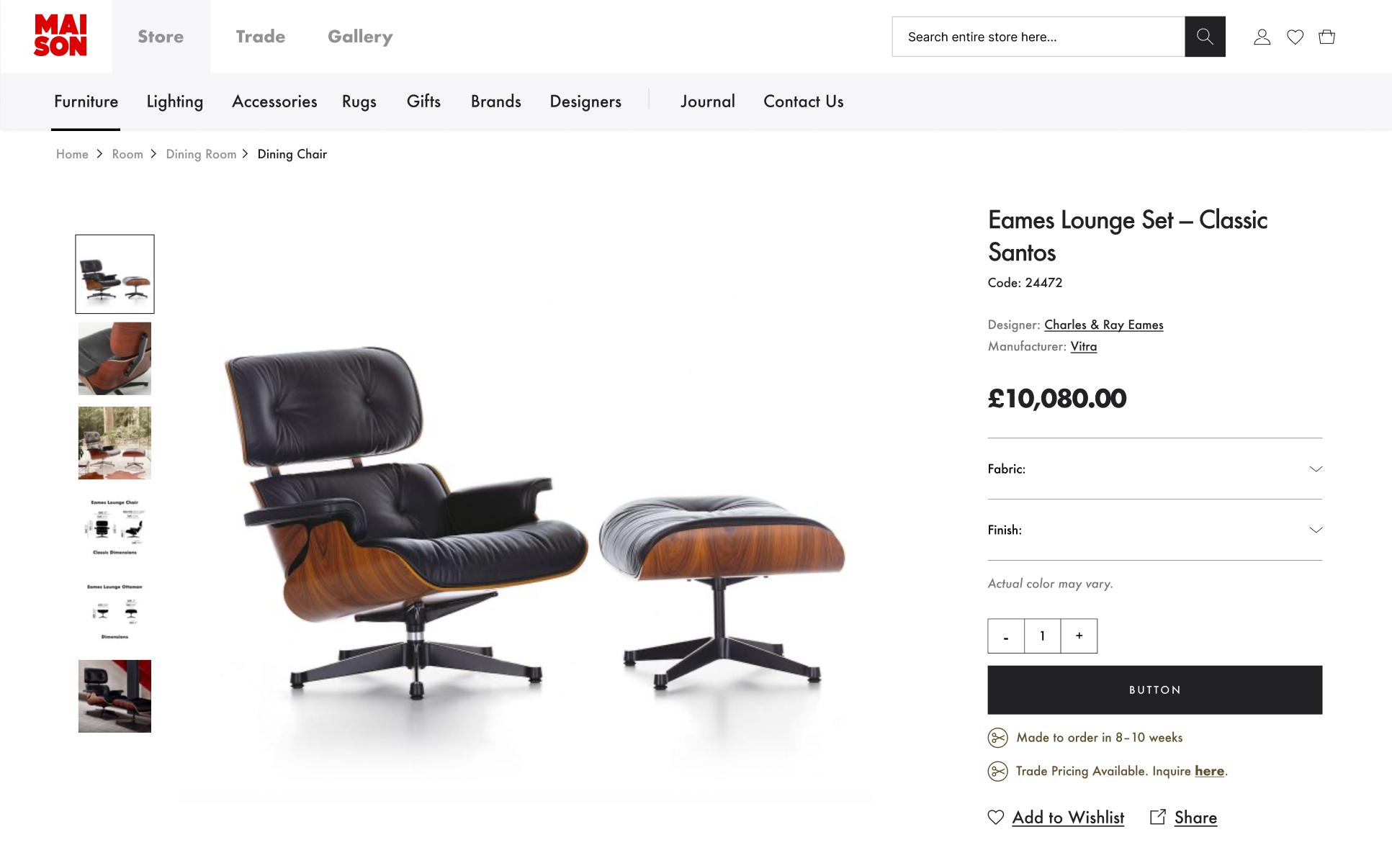
The original PDP was visually overwhelming and made it hard for customers to confidently select a product. The redesign focuses on clarity, hierarchy, and a more guided configuration experience.
Solution: Part II - Redesigning the PDP
Clean, structured layout: I reorganized the elements on the page so they followed a logical visual hierarchy. I grouped together important information, so users can understand everything at a quick glance.
Clearer flow: Users are now walked through the configuration flow step by step instead of one button making multiple selections. Now users are taken from Finish to Base to Upholstery, to ensure they understand each element they are customizing.
Availability cues are prominent: Whether a product is in-stock, made-to-order, or unavailable is clearly communicated. I moved this close to the “Add to Cart” button, so there is no need to guess or scroll.
Less friction overall: Instead of having to manually type in a quantity, users can now use an intuitive stepper to select the quantity of the item they want. I also reduced clutter in the price area, and give the CTA more room and prominence on the page.
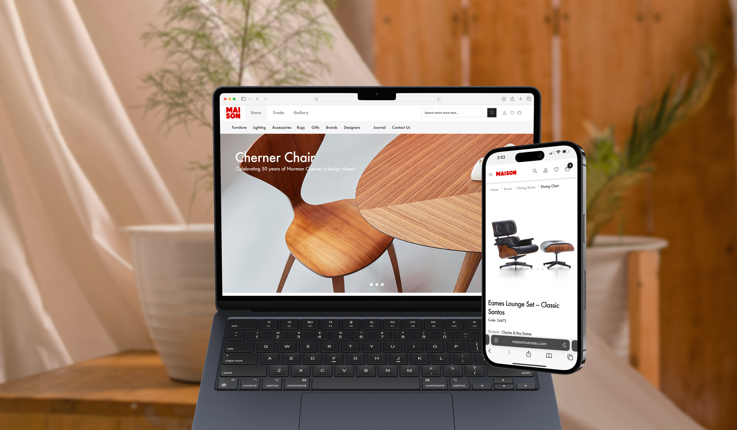
Checking in with our user Clara, this new PDP removes guesswork and will help Clara checkout faster and more confidently — exactly what a busy, design-savvy professional requires of an online shopping experience.
Redesigned PDP that is cleaner, more structured, and helps users like Clara understand their options, see availability upfront , and confidently checkout.
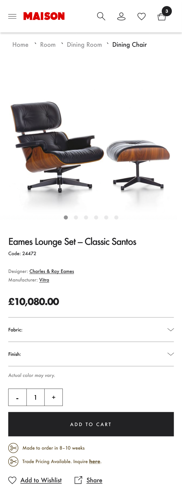
PDP Redesign on Mobile
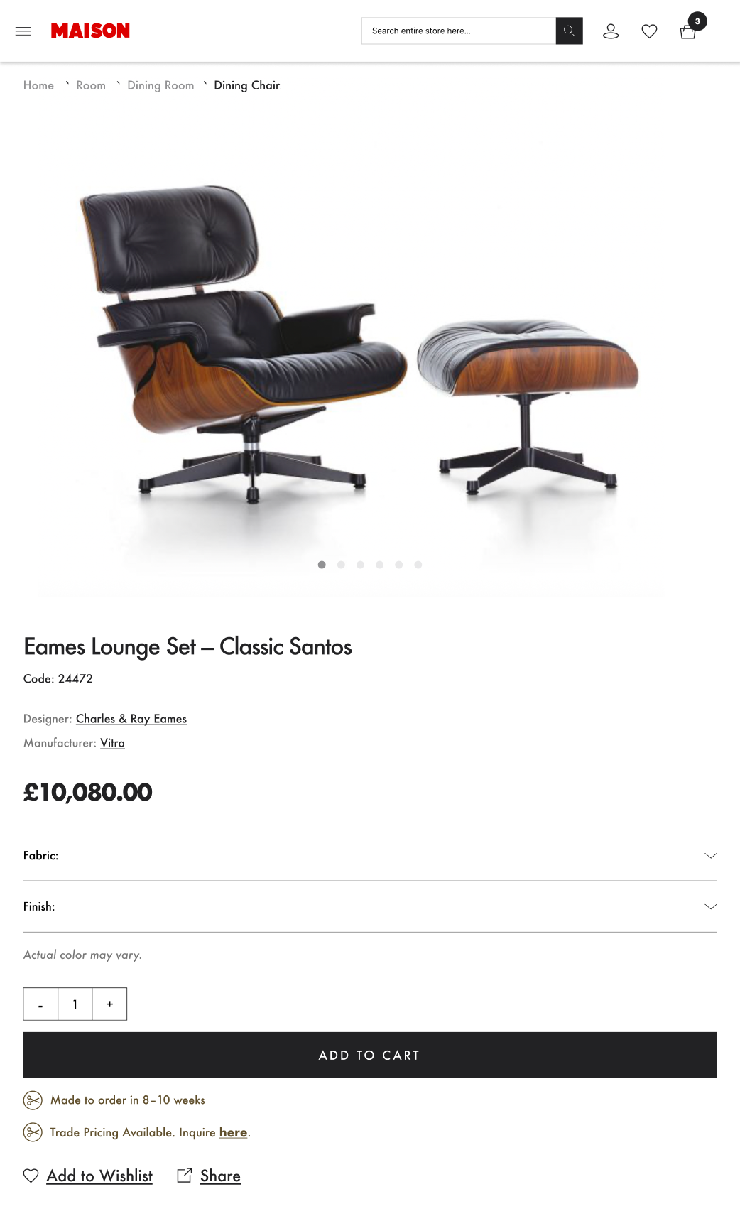
PDP Redesign on Tablet
Additional Use Cases
Product in stock

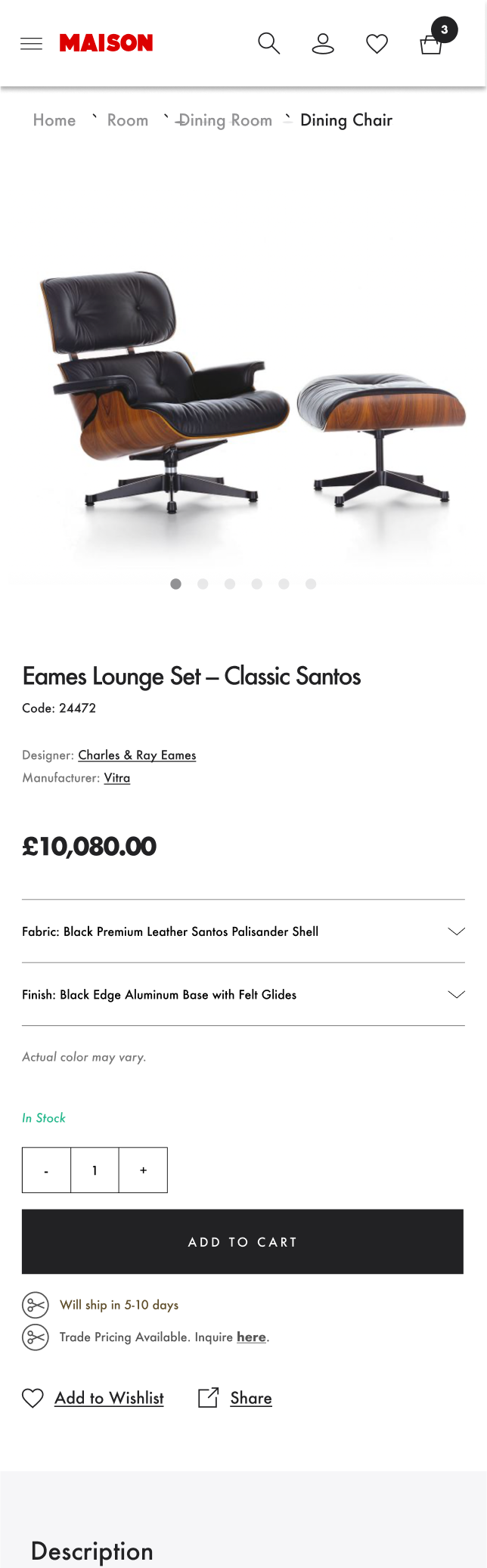
Product selected

Product on sale
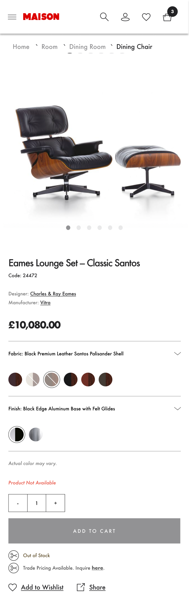
Product out of stock
Conclusion
In the end, the new Maison experience is clearer, calmer, and designed with customers like Clara in mind.
I transformed the meganav from overwhelming to inviting, helping users easily discover products; and the PDP from cluttered and confusing to structured and easy to scan. Improving these crucial steps in the checkout flow should lead to fewer abandoned carts, more discoveries, and lots of happy customers.
I am really pleased to have been apart of this project, and been able to experience designing in the e-commerce world. This is an area I want to pursue and grow my talents in.